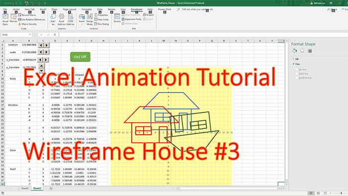
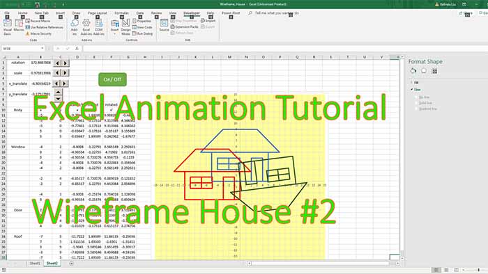
This is a basic demo investigating the feasibility of using anaglyph sprites to plot scientiffic data. Open the attached worksheet and with your 3D glasses on, watch the chart.
The data results are various temperature maps obtained from a 2D heat transfer model in a metal plate. You have 4 different selectable mapps there but you can also invert the pattern using the “Flip” button.
I find the 3D effect to be decent but not good enough for plotting scientific data.
What is your opinion? I will soon produce a similar model but in 3D wireframe (red and cyan).


