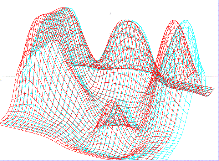
This is another basic demo investigating the feasibility of using anaglyph wireframes to plot scientiffic data. Open the attached worksheet and with your 3D glasses on, watch the chart. The data is a dynamic temperature map obtained from a 2D heat transfer model in a metal plate.
The heat model is complete and you can run it with various parameters. You can hit “Start / Pause” and manually adjust the pitch and yaw, or just hit “Demo” and the model will spin in increments of 5 degrees per macro iteration.
The 3D effect is quite good, better than the previous model. Range C211:AP250 contains the initial temperature map (you can change that to your preference to make the curve look different. Range C151:AP190 is the ambient map. You can change that too. Don’t touch the other two arrays. Enjoy, George.


This is very cool. Thank you !
Gracias Pedro!
This is very cool! I’m glad I bought some anaglyph glasses off ebay just so I could view yourexcellent work! 🙂
Thanks for the comment, John. Also try playing with colors, thicknesses and spans. Let me know if you find a clearly better option. Also in the range C211:AP250 you can input whatever initial constant temperatures you like (a map of initial conditions). I built a castle once like that. Change the conductivities and also the ambient map (one array up from the initial temps.). All the best, George