This last section of introductory PLL modeling shows how to upgrade the model with adjustable scale charts for three voltage signals within the loop.
The model also shows how to create a Lissajous based phase display.
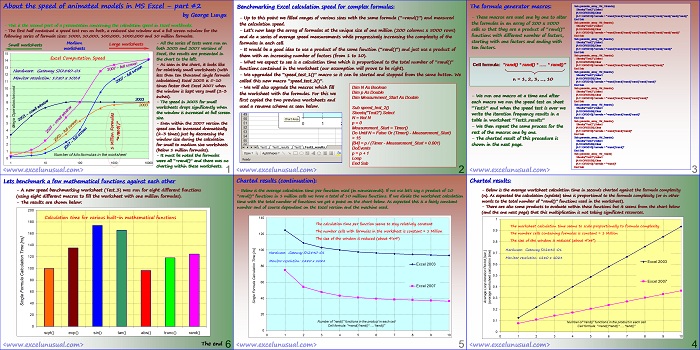
![]()

[sociallocker]![]() [/sociallocker]
[/sociallocker]
How to Model a Phase-Locked Loop (PLL) in Excel – part #4
-This is the continuation of part #2 of the PLL tutorial. The previous part described the implementation of the K_pd
calculations in the worksheet as well as the macros that allowed model to run.
– This section will deal with charting the real time data while the simulation is active.
K_vco, VCO
– The last tutorial of the introduction to PLL building series. Other PLL tutorials will follow but will focus on
various aspects of PLL functionality, refinement of the model and various applications of this type of circuit.
Out
Noise
<excelunusual.com>
Create a new copy of the worksheet
– Open PLL_Tutorial.xls and copy the last worksheet (PLL_Tutorial_3). Rename the new worksheet
PLL_Tutorial_4.
– Reassign the “Reset” macro corresponding to the new worksheet to the “Reset” button in the new worksheet.
– Reassign the “Start_Pause” macro corresponding to the new worksheet to the “Start_Pause” button in the new worksheet.
Create a “Time_Scale” series and chart: uLPF(t), uin(t) and uout(t)
– The current PLL model can run continuously in an infinite loop limited just by the maximum size of the
numbers in the worksheet (the instantaneous phase in an ever increasing number during the run).
Plotting various voltages as a function of the absolute time will be all right at the beginning but as the
time advances, the chart will be emptier and emptier since there are only 5000 points of data available
for display (5000* time_step meaningful information) and the chart range will steadily increase.
– A solution to fix the problem of the “almost empty” chart, would be plotting the waveform information
on a static scale just like an oscilloscope does. Let’s create such a scale:
– I18: “=0”
– I19: “=I18+B$1”
– copy I19 down to I5018
– Plot uLPF(t) against “Time_Scale” on a scatter chart
(5000 points of x-y data)
– Also plot both uin(t) and uout(t) against “Time_Scale” on
a second scatter chart
Rename the charts:
– Hold “Ctrl” key down and left-click the chart. Now the chart will be selected as object (white handles instead
of black handles)
White handles => proper selection (can change chart name)
Black handles => wrong selection (cannot change chart name)
-Click in the Name Box (above the top left visible cell,
to the left of the Formula Bar), where it probably says
something like “Chart 23”, and type the name you
want (Chart_1), then press Enter.
– Repeat the process with the bottom chart and change its name to “Chart_2”.
Quick-axis-rescale macros:
– The macros below will scale the x-axes of the two charts respectively following an oscilloscope type increment
rule (1,2,5,10,…). The macros make use of arrays to store scaling lookup tables.
Private Sub Scale_X1_Change()
arrScale = Array(1, 2, 5, 10, 20, 50, 100, 200)
aX = arrScale(Scale_X1.Value)
ActiveSheet.ChartObjects(“Chart_1”).Chart.Axes(xlCategory).MaximumScale = aX
End Sub
Private Sub Scale_X2_Change()
arrScale = Array(1, 2, 5, 10, 20, 50, 100, 200)
bX = arrScale(Scale_X2.Value)
ActiveSheet.ChartObjects(“Chart_2”).Chart.Axes(xlCategory).MaximumScale = bX
End Sub
Create a couple of scale changing buttons for the charts:
– The buttons will be placed in the lower left corner of
each chart and will adjust the scales of the x-axes.
– The first (upper) button will be called “Scale_X1” and
will have a range of [0, 8].
– The second (lower) button will be called “Scale_X2”
and will have the same range of [0, 8].
Create a phase indicator dial and a phase chart:
– The phase indicator is essentially a live plot in which the x-axis information is
uin(t) and the y-axis information is uout(t). This is no more than a Lissajous display.
– The shape to the right was created using the Draw menu. It is a rounded corner
rectangle (square in our case) with a semitransparent fill (90%). Few segments of
line, letters and an arrow were included, and everything was grouped together.
This will be inserted in the phase indicator chart as a dial. DF
– To get an idea of how the pattern will look function of the phase difference
between signals, a sample of Lissajous patterns is shown in the next page. The
nine charts were build in the worksheet for demo purposes.
– Create a 2-cell table (range J19:J20) having zeros in both cells.
– Insert a 2D scatter chart having range B18:B200 as the x range and range F18:B200 as the y-range. Call this series
“Phase Pattern”. In the same chart, insert a new series having cell J19 as the x-range and cell J20 as the y-range, and
name this series “Dial”
– Set the scale of both chart axes to [-1.02, 1.02] and after that delete both axes and any grid lines.
– Adjust the colors of the background and the
curve patterns to your preference.
– Inserting the dial: Select the dial object => hold o
45 0o -45o
Shift down => Copy as Picture
– Click the central marker (the “Dial” series), wait
for a second and click again. The cursor turns into
a black cross.
– Hit Paste and now you have the dial overlapping
the phase curve. Because the dial pattern is 90%
transparent you will still see the phase curve well.
-Start the PLL model and adjust parameters until you have a phase difference of (circle). Adjust the size of the chart until you have the phase circle matching the dial circle.
Trim various parameters back and forth repeatedly.-The chart needs to be perfectly square.-At this point if you need to format the curve or the markers you need to push the dial pattern out of the way. You do this by typing a 9 (nine or any large number) in cell J19.
After you finish with the curve formatting type a zero back in cell J19 and this brings back the dial in the center of the chart
Adjust the size of the chart until you have the
phase circle matching the dial circle. Trim various
parameters back and forth repeatedly.
Hit the “Start/Pause” button to start or pause the model.
-Once the model is started you can adjust the input frequency (Fin) and watch uPD(t).
If that voltage settles, the loop is locked. If it oscillates, the loop is unlocked.
The faster the frequency of oscillation the farther you are from the capture band.
-Play with various parameters while the model is running.
The end.
by George Lungu <excelunusual.com> 6