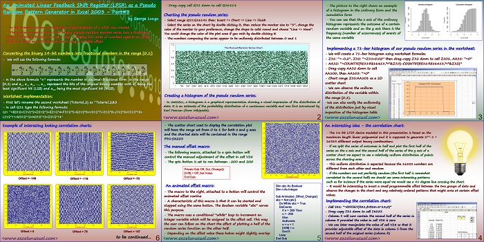
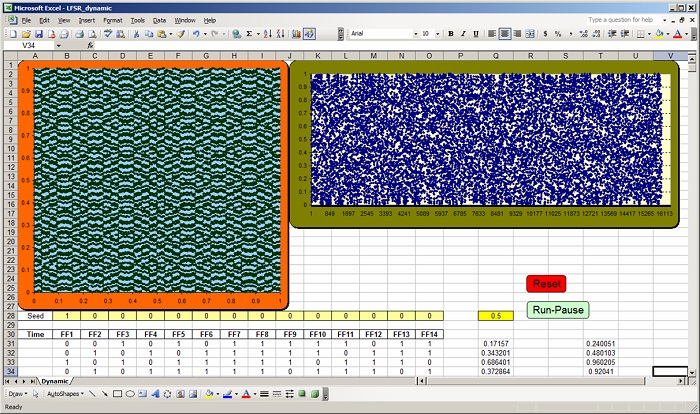
This is the third part of a tutorial (1, 2, self) describing the creation of an animated Pseudo Random Number Generator model as a Fibonacci type Linear Feedback Shift Register in MS Excel 2003. This section charts the pseudo random series after converting it from binary 14-bit numbers into decimal numbers scaled within the interval [0,1). A correlation chart is then created, displaying the first half of the series function of the second half, with a small adjustable offset (between -200, and 200). Two simple macros are used, one for the manual offset adjustment and one for the animated offset adjustment. Changing the offset (either manually or using the animated macro) one can notice various not-so-random patterns for certain offset values.
![]()
An Animated Linear Feedback Shift Register (LFSR) as a Pseudo Random Pattern Generator in Excel 2003 – Part#3
by George Lungu
– In the previous section, a table type implementation of a LFSR was created
– This section converts the 14-bit binary pseudo-random number series into a fractional
series of numbers between 0 and 1 then it display this series of numbers against an offset
version or itself on a 2D scatter chart using a variable offset.
Converting the binary 14-bit numbers into fractional numbers in the range [0,1]:
– We will use the following formula:
– In the above formula “n” represents the number in decimal-fractional form in the range
[0,1) and a0, a1, a2, …, a13 represent the bits of the original binary number with a0 being the
least significant bit (LSB) and a13 being the most significant bit (MSB).
Worksheet implementation:
– First let’s rename the second worksheet (Tutorial_2) as “Tutorial_2&3
– In cell Q31 type the following formula:
Q31: “=B31/2+C31/2^2+D31/2^3+E31/2^4+F31/2^5+G31/2^6+H31/2^7+I31/2^8+J31/2^9+K31/2^10+
L31/2^11+M31/2^12+N31/2^13+O31/2^14”
– Drag-copy cell Q31 down to cell Q16414
Charting the pseudo random series:
– Select range Q31:Q16141 then: Insert => Chart => Line => Finish
– Select the series on the chart by double clicking it, then reduce the marker size to “3”, change the
color of the marker to your preference, change the shape to solid round and choose “Line => None”.
You could change the color of the plot area if you wish by double clicking it.
– The numbers composing the series appear to be uniformly distributed between 0 and 1
1.2
The Pseoud Random Series Chart
1 764 1527 2290 3053 3816 4579 5342 6105 6868 7631 8394 9157 9920 10683 11446 12209 12972 13735 14498 15261 16024
Creating a histogram of the pseudo random series:
– In statistics, a histogram is a graphical representation showing a visual impression of the distribution of
data. It is an estimate of the probability distribution of a continuous variable and was first introduced by
Karl Pearson (from Wikipedia).
<excelunusual.com>
2
– The picture to the right shows an example
of a histogram in the ordinary form and the
cumulative form
– You can see that the x axis of the ordinary
histogram represents the outcome of a certain
random variable and on the y axis there is the
frequency (number of occurrences) of events of
the same variable
Implementing a 71-bar histogram of our pseudo random series in the worksheet:
– We will create a 71-bar histogram using worksheet formulas
– Z31: “=-0.2”, Z32: “=Z31+0.02” then drag-copy Z32 down to cell Z101, AA31: “=0”
– AA32: “=COUNTIF(R$31:R$16413,”<“&Z33)-COUNTIF(R$31:R$16413,”<“&Z32)”
– Drag-copy AA32 down to cell
AA100, then AA101: “=0”
– Chart range Z31:AA101 as a 2D
scatter chart
– We can observe the uniform
distribution of the variable within
the range [0,1).
-We can also verify the uniformity
of the distribution just by visual
inspection of the histogram table
<excelunusual.com>
3
An interesting idea – the correlation chart:
– The 14-bit LFSR device modeled in this presentation is based on the
maximum length linear polynomial and it is supposed to generate 214-1 =
16383 different output binary combinations.
– If we split the series of outcomes in half and plot the first half of the
series on the x axis and the second half of the series of the y axis of a
scatter chart we expect to see a relatively uniform distribution of points
across the charting area
– This uniform distribution is expected because the 16383 numbers are
different from each other and random
– If the numbers are not perfectly random (the first half is somewhat
correlated to the second half) we should see some interesting patterns
such as for instance if the series were equal we would see a 45 degree line crossing the chart.
– It would be interesting to insert a small programmable offset between the two groups of data and
observe the changes in the chart and any relatively ordered patterns that might arise at certain offset
values.
Implementing the correlation chart:
– Cell S31: “=OFFSET(R31,$V$28+2^13,0)”
– Drag-copy S31 down to cell S8223
– Column S will now contain the second half of the series in
column R provided the value in cell V28 is zero
– We can later manipulate the value of cell V28 so that it
provides adjustable offset of the data in column S from the
second half of the original series (column R)
<excelunusual.com>
4
– The scatter chart used to display the correlation plot
will have the range set from 0 to 1 for both x and y axes
and the charted data will be contained in the range
P31:S8223
The manual offset macro:
– The following macro, attached to a spin button will
control the manual adjustment of the offset in cell V28
– The spin button is set to run between -200 and 200
Private Sub Off_Set_Change()
[V28] = Off_Set.Value
End Sub
An animated offset macro: Dim abc As Boolean
Dim n As Integer
– The macro to the right, attached to a button will control the
animated offset routine Sub Animated_Offset_Change()
abc = Not (abc)
– A characteristic of this macro is that it can be started and
Do While abc = True
stopped using the same button. The Boolean variable “abc” serves
DoEvents
this purpose. If n > 200 Then
n = -200
– The macro uses a conditional “While” loop to increment an
Else
integer variable which will be assigned to the offset cell. This way
DoEvents
the user can follow on the chart the effect of plotting a half of the n = n + 1
[V28] = n
random series function on the other half.
End If
– Depending on the offset value these halves might slightly overlap
Loop
<excelunusual.com> End Sub
5
Example of interesting looking correlation charts:
to be continued…
<excelunusual.com>
6


Hello George,
Thanks for sharing all this amizing stuff with us. I would like to ask you how can i stimulate 2 or 3 dimensional heat transfer using excel? Thanks
Hi Theo, They are both easy to simulate and if you go back you can find a series of tutorials (search the word heat). The problem with 3D (which is done just like 2D is the visualization. Excel is not powerful enough for this type of visualization. Simulating 3D heat transfer is no problem though. George
I wold like to learn or known how to do logarithmic or semi logarithmic graph in excel?
Log charts are standard options in Excel. Just click and format the axes and in the menu there is a log/lin option.
Thanks Menezes!
Hello,
Thanks once again for this amazing sharing of ideas.
How wold like to learn or known how to do logarithmic or semi logarithmic graph in excel?