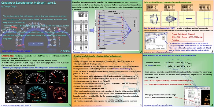
The previous tutorial (first half) explained how to download a speedometer picture from www.flickr.com and how to alter it (delete the needle) using a freeware called Gimp (similar to Photoshop).
– The model replaces the deleted needle from the picture with a moving one created from a chart line.
– This second half of the tutorial explains the geometry, trigonometry and VBA code used to build a new rotating speedometer needle to replace the static one deleted using Gimp.
![]()
[sociallocker] ![]() [/sociallocker]
[/sociallocker]
Creating a Speedometer in Excel – part 2.
by George Lungu
-The previous tutorial (first half) explains how to download a speedometer picture
from www.flickr.com and how to alter it (delete the needle) using a freeware called
Gimp (similar to Photoshop).
– The model replaces the deleted needle from the picture with a moving one created
from a chart line.
– This second half of the tutorial explains the geometry, trigonometry and VBA code
used to build a new rotating speedometer needle to replace the static one deleted
using Gimp.
<excelunusual.com>
Creating the speedometer needle:
The following two tables are used to create the
speedometer needle. You can check out the formulas in the lower table to see how the
speedometer needle is generated, just like a long snake. The upper table contains the
geometrical parameters of the needle.
Radius body
Radius tip
Radius back
<excelunusual.com> 2
Let’s see the effects of changing the needle parameters:
Radius_tip 1.5 Radius_tip 1.9 Radius_tip 1.3 Radius_tip 1.55
Radius_body 1 Radius_body 0 Radius_body 1.2 Radius_body 1.5
Radius_back -0.5 Radius_back -1 Radius_back -0.3 Radius_back -0.3
Width_back 1 Width_back 0.3 Width_back 0.1 Width_back 0.03
Width_body 1.5 Width_body 1 Width_body 0.1 Width_body 0.025
How do we change the angle in VBA?
– In order to tackle any variety of speedometer
pictures we need to set adjustable start-limit and end-limit angles for the needle in the spreadsheet.
Private Sub Speed_Change()
[E9] = [C8] – Speed * ([C8] – [C9]) / 200
End Sub
The spinner button controlling this macro has a range of
[0,200]. Looking at the above macro we can see that while on
0 the needle will have the custom angle typed in cell C9 and
while on 200 the needle will be set at the angle in cell C8.
<excelunusual.com> 3
How do we rotate the needle and set it at an adjustable offset?
Theoretical formulas for rotation and offset:
Create a second table in the range D22:C48 with rotation and offset formulas. The master angle
of rotation is placed in cell E9 and the offset data is located in the range C11:C12. The following
formulas were used:
“D22”: =B22*COS(RADIANS(E$9))-C22*SIN(RADIANS(E$9))+C$11
“E22”: =B22*SIN(RADIANS(E$9))+C22*COS(RADIANS(E$9))+C$12
After typing the above formulas in the range D22:E22, copy them down to row # 48.
<excelunusual.com> 4
Creating and sizing the chart and final adjustments:
– Create a 2D scatter chart with the data from the range “D22:C48” (D as x and C as y)
– Size both axes to [-2, 2] to begin with
– Choose the processed picture (with the original needle removed) and open it in any program
where you can see the width and height values (I used MS Office Picture Manager)
– Insert the picture as a chart background: Double click the plotting area => Fill Effects => Select
picture => OK => OK
– While the horizontal axis is set at a size of [-2, 2] we’ll calculate the vertical axis so that the
ratio of the horizontal picture size to vertical picture size is equal to the ratio of the two axes
– In this particular case the picture size is: 640 x 479
– Let’s calculate the vertical axis maximum: y_max = 479*2 / 640 = 1.4968 (it’s around 1.5)
– Let’s set the vertical axis to [-1.5, 1.5]
– Select and delete both axes one at a time
– Make sure to size the chart by stretching it manually until it has the right proportions (640/479)
– And finally adjust the length of the needle and the needle offset so that the axis of rotation
keeps the needle in the middle of the dial (for various angles the tip of the needle needs to be
around half of the notches)
– All the above steps require some repeated trial and error work but they are not hard to do
<excelunusual.com> 5
Create a hub:
Insert a new series in the chart called “Hub” whose coordinates are taken from
the center of the needle (C11:C12)
– Using the “Draw” menu create a circle as a shape filled with dark blue or black
– Select the circle you created => shift + copy as picture then highlight the new point (hub) on the
chart and paste the circle you have just created.
Different types of gauges created in Excel 2003 with pictures downloaded from Flickr:
Toyota Camry
r.p.m. meter
Ford Crown Victoria
by George Lungu <excelunusual.com>


was waiting since i saw the cockpit reporting in ajax….
i love the thing…..
waiting to implement at my work….
Really thanx a tonnn……
best of excel sheets which i have seen,
couldn’t have imagine this
thank you for Sharing
B22*SIN(RADIANS(E$9))+C22*COS(RADIANS(E$9))
what is the relation of this formula to equation of circle , X=a+cost, Y = b+sint
Please explain
Thanks Abdul,
As you mentioned the formula below is the parametric circle formula. Strictly speaking the excel formula that you wrote on above has a=0, b=0 (you can modify that if you wish) but there are two different scale factors you can choose (B22, C22) and they are adjusted function of the size of the clock face you paste in. Normally B22 should be equal to C22 and equal to the clock arm length, but if you choose a clock which is non-square (rectangular for instance) you could have the clock arm ends move on ellipses rather than circles.
George I am jealous , being human to remember all those trigonometrical formulae and macros.. 😛 copy paste is always best strategy , untill it has got copy rights.
Speedo meter is Super. 🙂
Thanks Kamal! I agree with you on this one. I either remember the easy ones or I go to Wikipedia for some help. My parents were both high school teachers so I was sometimes forced to spend more time with formulae than with my hobbies. Of course the copy-paste strategy is the best when is not too laborious.