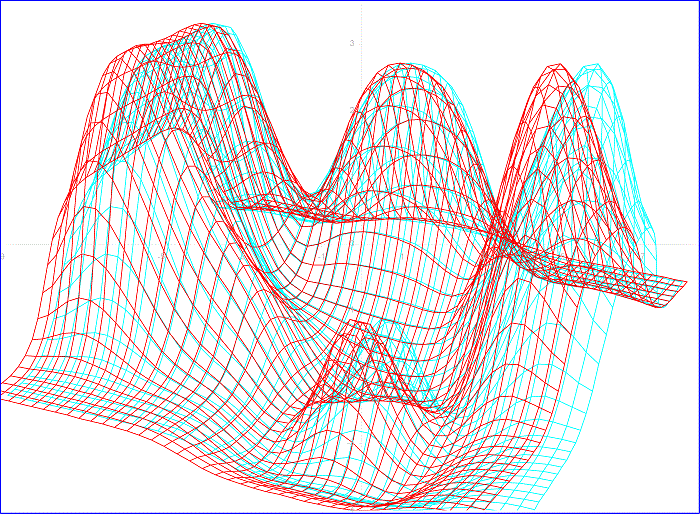
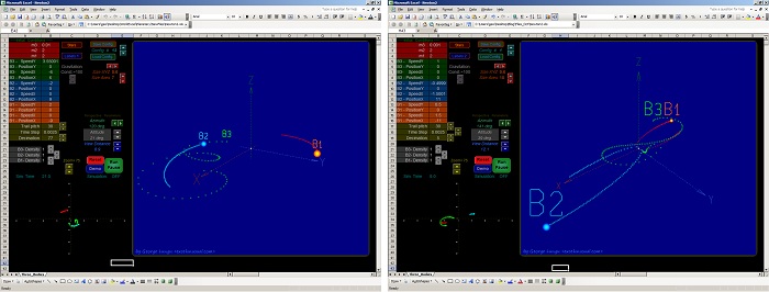
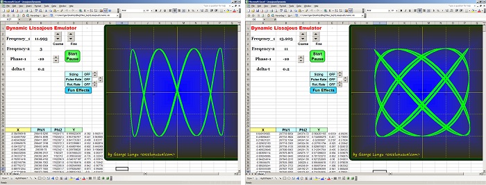
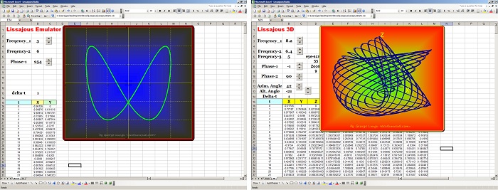
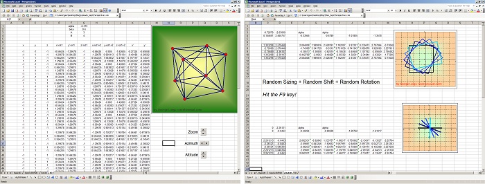
This is another basic demo investigating the feasibility of using anaglyph wireframes to plot scientiffic data. Open the attached worksheet and with your 3D glasses on, watch the chart. The data is a dynamic temperature map obtained from a 2D heat transfer model in a metal plate. The heat model is complete and you can run it with various parameters. You can… Read More... "Anaglyph Charts Demo #2- an animated heat transfer model using a red-cyan wireframe chart"